About-us Product Light
This carefully crafted About us component is perfect for Product landing pages, featuring a Light design that looks great and converts well.
Simply copy the code with the "Copy" button, paste it into your project and customize the colors, text and images to match your brand.
<!--
@type: About Us
@industry: Product
@style: Light
@category: Page Section, Content
@framework: HTML/CSS
@license: Free
-->
<style>
:root {
/* Colors */
--color-white: #ffffff;
--color-gray-50: #f9fafb;
--color-gray-200: #e5e7eb;
--color-gray-600: #4b5563;
--color-gray-800: #1f2937;
--color-blue-100: #dbeafe;
--color-blue-600: #2563eb;
--color-blue-700: #1d4ed8;
/* Spacing */
--spacing-1: 0.25rem;
--spacing-3: 0.75rem;
--spacing-4: 1rem;
--spacing-6: 1.5rem;
--spacing-8: 2rem;
--spacing-12: 3rem;
--spacing-16: 4rem;
--spacing-20: 5rem;
--spacing-24: 6rem;
/* Container */
--container-max-width: 80rem; /* max-w-7xl */
--content-max-width: 48rem; /* max-w-3xl */
}
/* Reset */
* {
box-sizing: border-box;
margin: 0;
padding: 0;
}
/* Base Styles */
body {
font-family: ui-sans-serif, system-ui, sans-serif, "Apple Color Emoji", "Segoe UI Emoji", "Segoe UI Symbol", "Noto Color Emoji";
line-height: 1.5;
}
/* Component Styles */
.about-section {
background-color: var(--color-gray-50);
padding: var(--spacing-16) 0;
}
.about-container {
max-width: var(--container-max-width);
margin: 0 auto;
padding: 0 var(--spacing-4);
}
.section-header {
text-align: center;
margin-bottom: var(--spacing-16);
}
.section-title {
font-size: 1.875rem;
font-weight: 500;
color: var(--color-gray-800);
margin-bottom: var(--spacing-4);
}
.section-description {
font-size: 1.125rem;
color: var(--color-gray-600);
max-width: var(--content-max-width);
margin: 0 auto;
}
.story-grid {
display: grid;
grid-template-columns: 1fr;
gap: var(--spacing-12);
align-items: center;
margin-bottom: var(--spacing-20);
}
.story-content {
order: 2;
}
.story-title {
font-size: 1.5rem;
font-weight: 500;
color: var(--color-gray-800);
margin-bottom: var(--spacing-6);
}
.story-text {
font-size: 1rem;
color: var(--color-gray-600);
margin-bottom: var(--spacing-6);
}
.story-text:last-of-type {
margin-bottom: var(--spacing-8);
}
.story-link {
display: inline-flex;
align-items: center;
color: var(--color-blue-600);
font-weight: 500;
text-decoration: none;
transition: color 0.2s ease;
}
.story-link:hover {
color: var(--color-blue-700);
}
.story-link-icon {
width: 1.25rem;
height: 1.25rem;
margin-left: var(--spacing-1);
}
.story-image-wrapper {
order: 1;
border-radius: 1rem;
overflow: hidden;
box-shadow: 0 1px 2px rgba(0, 0, 0, 0.05);
}
.story-image {
width: 100%;
height: auto;
object-fit: cover;
}
.values-section {
margin-bottom: var(--spacing-20);
}
.values-title {
font-size: 1.5rem;
font-weight: 500;
color: var(--color-gray-800);
text-align: center;
margin-bottom: var(--spacing-8);
}
.values-grid {
display: grid;
grid-template-columns: 1fr;
gap: var(--spacing-8);
}
.value-card {
background-color: var(--color-white);
border: 1px solid var(--color-gray-200);
border-radius: 1rem;
padding: var(--spacing-8);
box-shadow: 0 1px 2px rgba(0, 0, 0, 0.05);
}
.value-icon-wrapper {
width: 3rem;
height: 3rem;
background-color: var(--color-blue-100);
border-radius: 0.5rem;
display: flex;
align-items: center;
justify-content: center;
margin-bottom: var(--spacing-6);
}
.value-icon {
width: 1.5rem;
height: 1.5rem;
color: var(--color-blue-600);
}
.value-title {
font-size: 1.25rem;
font-weight: 400;
color: var(--color-gray-800);
margin-bottom: var(--spacing-3);
}
.value-description {
color: var(--color-gray-600);
}
/* Responsive Breakpoints */
@media (min-width: 640px) {
.about-section {
padding: var(--spacing-24) 0;
}
.about-container {
padding: 0 var(--spacing-6);
}
.section-title {
font-size: 2.25rem;
}
}
@media (min-width: 768px) {
.values-grid {
grid-template-columns: repeat(2, 1fr);
}
}
@media (min-width: 1024px) {
.about-container {
padding: 0 var(--spacing-8);
}
.story-grid {
grid-template-columns: repeat(2, 1fr);
}
.story-content {
order: 1;
}
.story-image-wrapper {
order: 2;
}
.values-grid {
grid-template-columns: repeat(3, 1fr);
}
}
</style>
<section class="about-section">
<div class="about-container">
<!-- Section header -->
<div class="section-header">
<h2 class="section-title">About Lumina</h2>
<p class="section-description">We're on a mission to create products that empower creators and make design accessible to everyone.</p>
</div>
<!-- Our story -->
<div class="story-grid">
<div class="story-content">
<h3 class="story-title">Our Story</h3>
<p class="story-text">
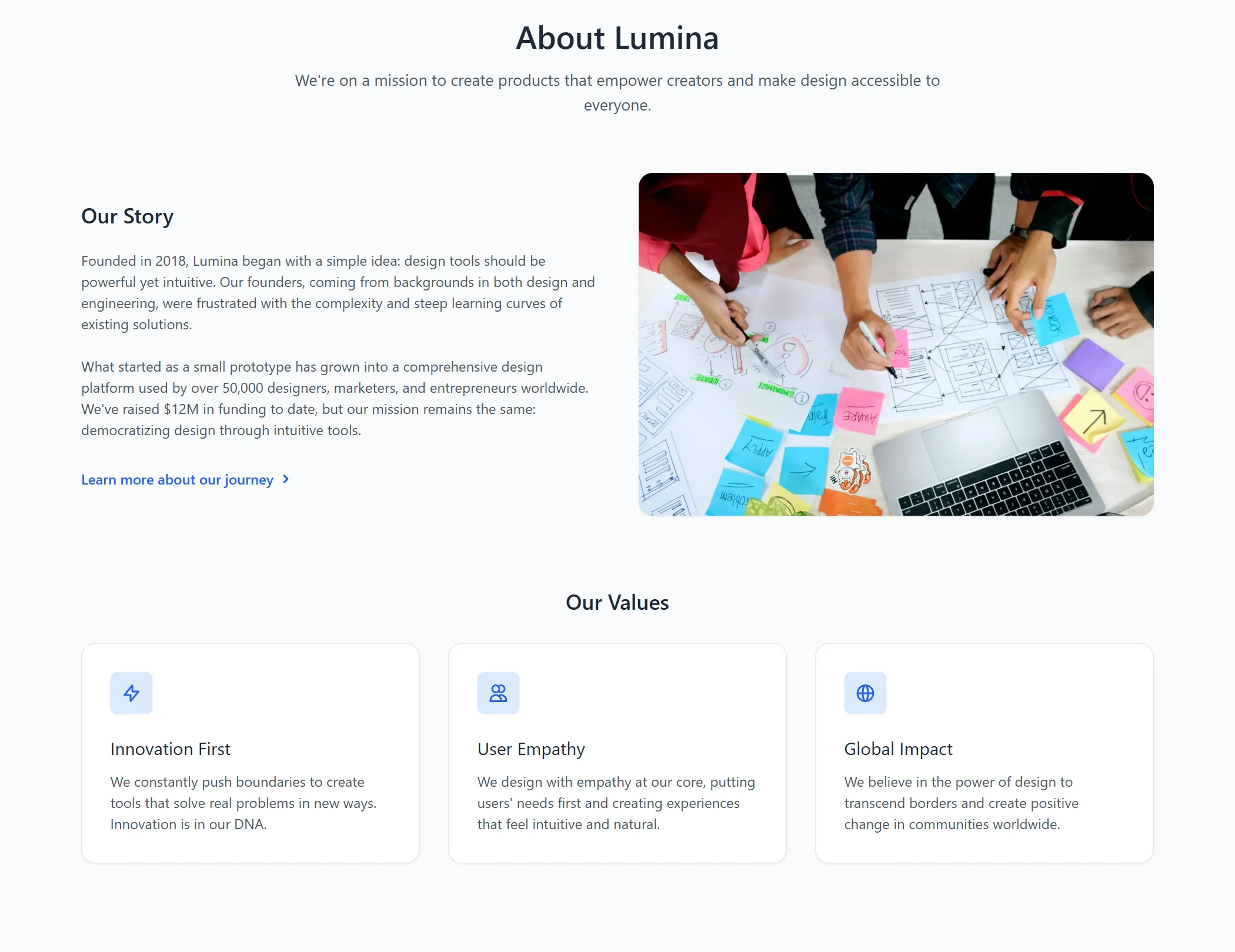
Founded in 2018, Lumina began with a simple idea: design tools should be powerful yet intuitive. Our founders, coming from backgrounds in both design and engineering, were frustrated with the complexity and steep learning curves of existing solutions.
</p>
<p class="story-text">
What started as a small prototype has grown into a comprehensive design platform used by over 50,000 designers, marketers, and entrepreneurs worldwide. We've raised $12M in funding to date, but our mission remains the same: democratizing design through intuitive tools.
</p>
<a href="#" class="story-link">
Learn more about our journey
<svg xmlns="http://www.w3.org/2000/svg" class="story-link-icon" viewBox="0 0 20 20" fill="currentColor" aria-hidden="true">
<path fill-rule="evenodd" d="M7.293 14.707a1 1 0 010-1.414L10.586 10 7.293 6.707a1 1 0 011.414-1.414l4 4a1 1 0 010 1.414l-4 4a1 1 0 01-1.414 0z" clip-rule="evenodd" />
</svg>
</a>
</div>
<div class="story-image-wrapper">
<img
src="https://landinggo.com/assets/img/stock/hero/marketing-unsplash-1920x1080.webp"
alt="Our team collaborating on design projects"
class="story-image"
loading="lazy"
width="1920"
height="1080"
>
</div>
</div>
<!-- Our values -->
<div class="values-section">
<h3 class="values-title">Our Values</h3>
<div class="values-grid">
<!-- Value 1 -->
<div class="value-card">
<div class="value-icon-wrapper">
<svg xmlns="http://www.w3.org/2000/svg" class="value-icon" fill="none" viewBox="0 0 24 24" stroke="currentColor" aria-hidden="true">
<path stroke-linecap="round" stroke-linejoin="round" stroke-width="2" d="M13 10V3L4 14h7v7l9-11h-7z" />
</svg>
</div>
<h4 class="value-title">Innovation First</h4>
<p class="value-description">We constantly push boundaries to create tools that solve real problems in new ways. Innovation is in our DNA.</p>
</div>
<!-- Value 2 -->
<div class="value-card">
<div class="value-icon-wrapper">
<svg xmlns="http://www.w3.org/2000/svg" class="value-icon" fill="none" viewBox="0 0 24 24" stroke="currentColor" aria-hidden="true">
<path stroke-linecap="round" stroke-linejoin="round" stroke-width="2" d="M12 4.354a4 4 0 110 5.292M15 21H3v-1a6 6 0 0112 0v1zm0 0h6v-1a6 6 0 00-9-5.197M13 7a4 4 0 11-8 0 4 4 0 018 0z" />
</svg>
</div>
<h4 class="value-title">User Empathy</h4>
<p class="value-description">We design with empathy at our core, putting users' needs first and creating experiences that feel intuitive and natural.</p>
</div>
<!-- Value 3 -->
<div class="value-card">
<div class="value-icon-wrapper">
<svg xmlns="http://www.w3.org/2000/svg" class="value-icon" fill="none" viewBox="0 0 24 24" stroke="currentColor" aria-hidden="true">
<path stroke-linecap="round" stroke-linejoin="round" stroke-width="2" d="M21 12a9 9 0 01-9 9m9-9a9 9 0 00-9-9m9 9H3m9 9a9 9 0 01-9-9m9 9c1.657 0 3-4.03 3-9s-1.343-9-3-9m0 18c-1.657 0-3-4.03-3-9s1.343-9 3-9m-9 9a9 9 0 019-9" />
</svg>
</div>
<h4 class="value-title">Global Impact</h4>
<p class="value-description">We believe in the power of design to transcend borders and create positive change in communities worldwide.</p>
</div>
</div>
</div>
</div>
</section>
                <!--
@type: About Us
@industry: Product
@style: Light
@category: Page Section, Content
@framework: Tailwind
@license: Free
-->

<section class="bg-gray-50 py-16 sm:py-24">
  <div class="max-w-7xl mx-auto px-4 sm:px-6 lg:px-8">
    <!-- Section header -->
    <div class="text-center mb-16">
      <h2 class="text-3xl font-medium text-gray-800 sm:text-4xl mb-4">About Lumina</h2>
      <p class="text-lg text-gray-600 max-w-3xl mx-auto">We're on a mission to create products that empower creators and make design accessible to everyone.</p>
    </div>

    <!-- Our story -->
    <div class="grid grid-cols-1 lg:grid-cols-2 gap-12 items-center mb-20">
      <div class="order-2 lg:order-1">
        <h3 class="text-2xl font-medium text-gray-800 mb-6">Our Story</h3>
        <p class="text-base text-gray-600 mb-6">
          Founded in 2018, Lumina began with a simple idea: design tools should be powerful yet intuitive. Our founders, coming from backgrounds in both design and engineering, were frustrated with the complexity and steep learning curves of existing solutions.
        </p>
        <p class="text-base text-gray-600 mb-8">
          What started as a small prototype has grown into a comprehensive design platform used by over 50,000 designers, marketers, and entrepreneurs worldwide. We've raised $12M in funding to date, but our mission remains the same: democratizing design through intuitive tools.
        </p>
        <a href="#" class="inline-flex items-center text-blue-600 font-medium hover:text-blue-700">
          Learn more about our journey
          <svg xmlns="http://www.w3.org/2000/svg" class="h-5 w-5 ml-1" viewBox="0 0 20 20" fill="currentColor" aria-hidden="true">
            <path fill-rule="evenodd" d="M7.293 14.707a1 1 0 010-1.414L10.586 10 7.293 6.707a1 1 0 011.414-1.414l4 4a1 1 0 010 1.414l-4 4a1 1 0 01-1.414 0z" clip-rule="evenodd" />
          </svg>
        </a>
      </div>
      <div class="order-1 lg:order-2">
        <!-- Product design image -->
        <div class="rounded-2xl overflow-hidden shadow-sm">
          <!-- Product design image by Unsplash -->
          <img
            src="https://landinggo.com/assets/img/stock/hero/marketing-unsplash-1920x1080.webp"
            alt="Our team collaborating on design projects"
            class="w-full h-auto object-cover"
            loading="lazy"
            width="1920"
            height="1080"
          >
        </div>
      </div>
    </div>

    <!-- Our values -->
    <div class="mb-20">
      <h3 class="text-2xl font-medium text-gray-800 text-center mb-8">Our Values</h3>
      <div class="grid grid-cols-1 md:grid-cols-2 lg:grid-cols-3 gap-8">
        <!-- Value 1 -->
        <div class="bg-white border border-gray-200 rounded-2xl p-8 shadow-sm">
          <div class="w-12 h-12 bg-blue-100 rounded-lg flex items-center justify-center mb-6">
            <svg xmlns="http://www.w3.org/2000/svg" class="h-6 w-6 text-blue-600" fill="none" viewBox="0 0 24 24" stroke="currentColor" aria-hidden="true">
              <path stroke-linecap="round" stroke-linejoin="round" stroke-width="2" d="M13 10V3L4 14h7v7l9-11h-7z" />
            </svg>
          </div>
          <h4 class="text-xl font-normal text-gray-800 mb-3">Innovation First</h4>
          <p class="text-gray-600">We constantly push boundaries to create tools that solve real problems in new ways. Innovation is in our DNA.</p>
        </div>

        <!-- Value 2 -->
        <div class="bg-white border border-gray-200 rounded-2xl p-8 shadow-sm">
          <div class="w-12 h-12 bg-blue-100 rounded-lg flex items-center justify-center mb-6">
            <svg xmlns="http://www.w3.org/2000/svg" class="h-6 w-6 text-blue-600" fill="none" viewBox="0 0 24 24" stroke="currentColor" aria-hidden="true">
              <path stroke-linecap="round" stroke-linejoin="round" stroke-width="2" d="M12 4.354a4 4 0 110 5.292M15 21H3v-1a6 6 0 0112 0v1zm0 0h6v-1a6 6 0 00-9-5.197M13 7a4 4 0 11-8 0 4 4 0 018 0z" />
            </svg>
          </div>
          <h4 class="text-xl font-normal text-gray-800 mb-3">User Empathy</h4>
          <p class="text-gray-600">We design with empathy at our core, putting users' needs first and creating experiences that feel intuitive and natural.</p>
        </div>

        <!-- Value 3 -->
        <div class="bg-white border border-gray-200 rounded-2xl p-8 shadow-sm">
          <div class="w-12 h-12 bg-blue-100 rounded-lg flex items-center justify-center mb-6">
            <svg xmlns="http://www.w3.org/2000/svg" class="h-6 w-6 text-blue-600" fill="none" viewBox="0 0 24 24" stroke="currentColor" aria-hidden="true">
              <path stroke-linecap="round" stroke-linejoin="round" stroke-width="2" d="M21 12a9 9 0 01-9 9m9-9a9 9 0 00-9-9m9 9H3m9 9a9 9 0 01-9-9m9 9c1.657 0 3-4.03 3-9s-1.343-9-3-9m0 18c-1.657 0-3-4.03-3-9s1.343-9 3-9m-9 9a9 9 0 019-9" />
            </svg>
          </div>
          <h4 class="text-xl font-normal text-gray-800 mb-3">Global Impact</h4>
          <p class="text-gray-600">We believe in the power of design to transcend borders and create positive change in communities worldwide.</p>
        </div>
      </div>
    </div>
  </div>
</section>
This is a Pro component
Access the full component collection
Get all premium components and focus on building your business
Unlock for $49
(one-time payment)Early bird discount. Lock in this price forever
Premium components
Get access to all pro components. New ones added monthly
Save components
Save your favorite components to your account
Unlimited usage
Use components as often as you want
Landing page submissions
Get your landing pages featured on LandingGo and earn a
strong backlink
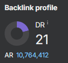 21 DR dofollow backlink from the main page