Button SaaS Minimal
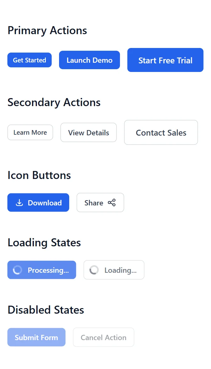
This carefully crafted Button component is perfect for SaaS landing pages, featuring a Minimal design that looks great and converts well.
Simply copy the code with the "Copy" button, paste it into your project and customize the colors, text and images to match your brand.
                <!--
@type: Button
@industry: SaaS
@style: Minimal
@category: UI Element
@framework: HTML/CSS
@license: Free
-->

<style>
/* CSS Custom Properties */
:root {
  /* Colors */
  --blue-600: #2563eb;
  --blue-700: #1d4ed8;
  --blue-500: #3b82f6;
  --gray-50: #f9fafb;
  --gray-300: #d1d5db;
  --gray-700: #374151;
  --gray-900: #111827;
  --white: #ffffff;

  /* Font Family */
  --font-sans: ui-sans-serif, system-ui, sans-serif, "Apple Color Emoji", "Segoe UI Emoji", "Segoe UI Symbol", "Noto Color Emoji";
}

/* Reset */
* {
  box-sizing: border-box;
  margin: 0;
  padding: 0;
  font-family: var(--font-sans);
}

/* Container Styles */
.button-section {
  padding: 3rem 1rem;
  background-color: var(--white);
}

.container {
  max-width: 72rem;
  margin: 0 auto;
}

.button-group {
  margin-bottom: 3rem;
}

.button-group h2 {
  font-size: 1.5rem;
  font-weight: 600;
  color: var(--gray-900);
  margin-bottom: 1.5rem;
}

.button-wrapper {
  display: flex;
  flex-wrap: wrap;
  gap: 1rem;
  align-items: center;
}

/* Base Button Styles */
.btn {
  display: inline-flex;
  align-items: center;
  font-weight: 500;
  border-radius: 0.5rem;
  transition: all 0.2s;
  cursor: pointer;
  border: none;
}

.btn:focus {
  outline: none;
  box-shadow: 0 0 0 2px var(--white), 0 0 0 4px var(--blue-500);
  ring-offset: 2px;
}

/* Primary Button Styles */
.btn-primary {
  background-color: var(--blue-600);
  color: var(--white);
  border: 1px solid transparent;
}

.btn-primary:hover:not(:disabled) {
  background-color: var(--blue-700);
}

/* Secondary Button Styles */
.btn-secondary {
  background-color: var(--white);
  color: var(--gray-700);
  border: 1px solid var(--gray-300);
}

.btn-secondary:hover:not(:disabled) {
  background-color: var(--gray-50);
}

.btn-secondary:focus {
  box-shadow: 0 0 0 2px var(--white), 0 0 0 4px var(--gray-300);
  ring-offset: 2px;
}

/* Button Sizes */
.btn-sm {
  padding: 0.375rem 0.75rem;
  font-size: 0.875rem;
}

.btn-md {
  padding: 0.5rem 1rem;
  font-size: 1rem;
}

.btn-lg {
  padding: 0.75rem 1.5rem;
  font-size: 1.125rem;
}

/* Icon Styles */
.btn svg {
  width: 1.25rem;
  height: 1.25rem;
}

.btn-icon-left svg {
  margin-right: 0.5rem;
}

.btn-icon-right svg {
  margin-left: 0.5rem;
}

/* Loading & Disabled States */
.btn-loading,
.btn:disabled {
  opacity: 0.5;
  cursor: not-allowed;
  pointer-events: none;
}

.btn-loading .spinner {
  margin-right: 0.75rem;
  margin-left: -0.25rem;
  animation: spin 1s linear infinite;
  width: 1.25rem;
  height: 1.25rem;
}

.btn-loading .spinner circle {
  opacity: 0.25;
}

.btn-loading .spinner path {
  opacity: 0.75;
}

@keyframes spin {
  from {
    transform: rotate(0deg);
  }
  to {
    transform: rotate(360deg);
  }
}

/* Media Queries */
@media (min-width: 768px) {
  .button-section {
    padding: 3rem 2rem;
  }
}
</style>

<section class="button-section">
    <div class="container">
        <!-- Primary Buttons -->
        <div class="button-group">
            <h2>Primary Actions</h2>
            <div class="button-wrapper">
                <!-- Small -->
                <button
                    type="button"
                    class="btn btn-primary btn-sm"
                    aria-label="Small primary button"
                >
                    Get Started
                </button>

                <!-- Medium (Default) -->
                <button
                    type="button"
                    class="btn btn-primary btn-md"
                    aria-label="Medium primary button"
                >
                    Launch Demo
                </button>

                <!-- Large -->
                <button
                    type="button"
                    class="btn btn-primary btn-lg"
                    aria-label="Large primary button"
                >
                    Start Free Trial
                </button>
            </div>
        </div>

        <!-- Secondary Buttons -->
        <div class="button-group">
            <h2>Secondary Actions</h2>
            <div class="button-wrapper">
                <!-- Small -->
                <button
                    type="button"
                    class="btn btn-secondary btn-sm"
                    aria-label="Small secondary button"
                >
                    Learn More
                </button>

                <!-- Medium (Default) -->
                <button
                    type="button"
                    class="btn btn-secondary btn-md"
                    aria-label="Medium secondary button"
                >
                    View Details
                </button>

                <!-- Large -->
                <button
                    type="button"
                    class="btn btn-secondary btn-lg"
                    aria-label="Large secondary button"
                >
                    Contact Sales
                </button>
            </div>
        </div>

        <!-- Icon Buttons -->
        <div class="button-group">
            <h2>Icon Buttons</h2>
            <div class="button-wrapper">
                <!-- Primary with Leading Icon -->
                <button
                    type="button"
                    class="btn btn-primary btn-md btn-icon-left"
                    aria-label="Download button with icon"
                >
                    <svg fill="none" stroke="currentColor" viewBox="0 0 24 24" xmlns="http://www.w3.org/2000/svg">
                        <path stroke-linecap="round" stroke-linejoin="round" stroke-width="2" d="M4 16v1a3 3 0 003 3h10a3 3 0 003-3v-1m-4-4l-4 4m0 0l-4-4m4 4V4"></path>
                    </svg>
                    Download
                </button>

                <!-- Secondary with Trailing Icon -->
                <button
                    type="button"
                    class="btn btn-secondary btn-md btn-icon-right"
                    aria-label="Share button with icon"
                >
                    Share
                    <svg fill="none" stroke="currentColor" viewBox="0 0 24 24" xmlns="http://www.w3.org/2000/svg">
                        <path stroke-linecap="round" stroke-linejoin="round" stroke-width="2" d="M8.684 13.342C8.886 12.938 9 12.482 9 12c0-.482-.114-.938-.316-1.342m0 2.684a3 3 0 110-2.684m0 2.684l6.632 3.316m-6.632-6l6.632-3.316m0 0a3 3 0 105.367-2.684 3 3 0 00-5.367 2.684zm0 9.316a3 3 0 105.368 2.684 3 3 0 00-5.368-2.684z"></path>
                    </svg>
                </button>
            </div>
        </div>

        <!-- Loading States -->
        <div class="button-group">
            <h2>Loading States</h2>
            <div class="button-wrapper">
                <!-- Primary Loading -->
                <button
                    type="button"
                    class="btn btn-primary btn-md btn-loading"
                    disabled
                    aria-label="Loading primary button"
                >
                    <svg class="spinner" fill="none" viewBox="0 0 24 24">
                        <circle class="opacity-25" cx="12" cy="12" r="10" stroke="currentColor" stroke-width="4"></circle>
                        <path class="opacity-75" fill="currentColor" d="M4 12a8 8 0 018-8V0C5.373 0 0 5.373 0 12h4zm2 5.291A7.962 7.962 0 014 12H0c0 3.042 1.135 5.824 3 7.938l3-2.647z"></path>
                    </svg>
                    Processing...
                </button>

                <!-- Secondary Loading -->
                <button
                    type="button"
                    class="btn btn-secondary btn-md btn-loading"
                    disabled
                    aria-label="Loading secondary button"
                >
                    <svg class="spinner" fill="none" viewBox="0 0 24 24">
                        <circle class="opacity-25" cx="12" cy="12" r="10" stroke="currentColor" stroke-width="4"></circle>
                        <path class="opacity-75" fill="currentColor" d="M4 12a8 8 0 018-8V0C5.373 0 0 5.373 0 12h4zm2 5.291A7.962 7.962 0 014 12H0c0 3.042 1.135 5.824 3 7.938l3-2.647z"></path>
                    </svg>
                    Loading...
                </button>
            </div>
        </div>

        <!-- Disabled States -->
        <div class="button-group">
            <h2>Disabled States</h2>
            <div class="button-wrapper">
                <!-- Primary Disabled -->
                <button
                    type="button"
                    class="btn btn-primary btn-md"
                    disabled
                    aria-label="Disabled primary button"
                >
                    Submit Form
                </button>

                <!-- Secondary Disabled -->
                <button
                    type="button"
                    class="btn btn-secondary btn-md"
                    disabled
                    aria-label="Disabled secondary button"
                >
                    Cancel Action
                </button>
            </div>
        </div>
    </div>
</section>
                <!--
@type: Button
@industry: SaaS
@style: Minimal
@category: UI Element
@framework: Tailwind
@license: Free
-->

<section class="py-12 px-4 md:px-8 bg-white">
    <div class="max-w-6xl mx-auto">
        <!-- Primary Buttons -->
        <div class="mb-12">
            <h2 class="text-2xl font-semibold text-gray-900 mb-6">Primary Actions</h2>
            <div class="flex flex-wrap gap-4 items-center">
                <!-- Small -->
                <button
                    type="button"
                    class="inline-flex items-center px-3 py-1.5 text-sm font-medium text-white bg-blue-600 rounded-lg hover:bg-blue-700 focus:outline-none focus:ring-2 focus:ring-offset-2 focus:ring-blue-500 transition-colors"
                    aria-label="Small primary button"
                >
                    Get Started
                </button>

                <!-- Medium (Default) -->
                <button
                    type="button"
                    class="inline-flex items-center px-4 py-2 text-base font-medium text-white bg-blue-600 rounded-lg hover:bg-blue-700 focus:outline-none focus:ring-2 focus:ring-offset-2 focus:ring-blue-500 transition-colors"
                    aria-label="Medium primary button"
                >
                    Launch Demo
                </button>

                <!-- Large -->
                <button
                    type="button"
                    class="inline-flex items-center px-6 py-3 text-lg font-medium text-white bg-blue-600 rounded-lg hover:bg-blue-700 focus:outline-none focus:ring-2 focus:ring-offset-2 focus:ring-blue-500 transition-colors"
                    aria-label="Large primary button"
                >
                    Start Free Trial
                </button>
            </div>
        </div>

        <!-- Secondary Buttons -->
        <div class="mb-12">
            <h2 class="text-2xl font-semibold text-gray-900 mb-6">Secondary Actions</h2>
            <div class="flex flex-wrap gap-4 items-center">
                <!-- Small -->
                <button
                    type="button"
                    class="inline-flex items-center px-3 py-1.5 text-sm font-medium text-gray-700 bg-white border border-gray-300 rounded-lg hover:bg-gray-50 focus:outline-none focus:ring-2 focus:ring-offset-2 focus:ring-gray-500 transition-colors"
                    aria-label="Small secondary button"
                >
                    Learn More
                </button>

                <!-- Medium (Default) -->
                <button
                    type="button"
                    class="inline-flex items-center px-4 py-2 text-base font-medium text-gray-700 bg-white border border-gray-300 rounded-lg hover:bg-gray-50 focus:outline-none focus:ring-2 focus:ring-offset-2 focus:ring-gray-500 transition-colors"
                    aria-label="Medium secondary button"
                >
                    View Details
                </button>

                <!-- Large -->
                <button
                    type="button"
                    class="inline-flex items-center px-6 py-3 text-lg font-medium text-gray-700 bg-white border border-gray-300 rounded-lg hover:bg-gray-50 focus:outline-none focus:ring-2 focus:ring-offset-2 focus:ring-gray-500 transition-colors"
                    aria-label="Large secondary button"
                >
                    Contact Sales
                </button>
            </div>
        </div>

        <!-- Icon Buttons -->
        <div class="mb-12">
            <h2 class="text-2xl font-semibold text-gray-900 mb-6">Icon Buttons</h2>
            <div class="flex flex-wrap gap-4 items-center">
                <!-- Primary with Leading Icon -->
                <button
                    type="button"
                    class="inline-flex items-center px-4 py-2 text-base font-medium text-white bg-blue-600 rounded-lg hover:bg-blue-700 focus:outline-none focus:ring-2 focus:ring-offset-2 focus:ring-blue-500 transition-colors"
                    aria-label="Download button with icon"
                >
                    <svg class="w-5 h-5 mr-2" fill="none" stroke="currentColor" viewBox="0 0 24 24" xmlns="http://www.w3.org/2000/svg">
                        <path stroke-linecap="round" stroke-linejoin="round" stroke-width="2" d="M4 16v1a3 3 0 003 3h10a3 3 0 003-3v-1m-4-4l-4 4m0 0l-4-4m4 4V4"></path>
                    </svg>
                    Download
                </button>

                <!-- Secondary with Trailing Icon -->
                <button
                    type="button"
                    class="inline-flex items-center px-4 py-2 text-base font-medium text-gray-700 bg-white border border-gray-300 rounded-lg hover:bg-gray-50 focus:outline-none focus:ring-2 focus:ring-offset-2 focus:ring-gray-500 transition-colors"
                    aria-label="Share button with icon"
                >
                    Share
                    <svg class="w-5 h-5 ml-2" fill="none" stroke="currentColor" viewBox="0 0 24 24" xmlns="http://www.w3.org/2000/svg">
                        <path stroke-linecap="round" stroke-linejoin="round" stroke-width="2" d="M8.684 13.342C8.886 12.938 9 12.482 9 12c0-.482-.114-.938-.316-1.342m0 2.684a3 3 0 110-2.684m0 2.684l6.632 3.316m-6.632-6l6.632-3.316m0 0a3 3 0 105.367-2.684 3 3 0 00-5.367 2.684zm0 9.316a3 3 0 105.368 2.684 3 3 0 00-5.368-2.684z"></path>
                    </svg>
                </button>
            </div>
        </div>

        <!-- Loading States -->
        <div class="mb-12">
            <h2 class="text-2xl font-semibold text-gray-900 mb-6">Loading States</h2>
            <div class="flex flex-wrap gap-4 items-center">
                <!-- Primary Loading -->
                <button
                    type="button"
                    class="inline-flex items-center px-4 py-2 text-base font-medium text-white bg-blue-600 rounded-lg opacity-75 cursor-not-allowed"
                    disabled
                    aria-label="Loading primary button"
                >
                    <svg class="animate-spin -ml-1 mr-3 h-5 w-5 text-white" fill="none" viewBox="0 0 24 24">
                        <circle class="opacity-25" cx="12" cy="12" r="10" stroke="currentColor" stroke-width="4"></circle>
                        <path class="opacity-75" fill="currentColor" d="M4 12a8 8 0 018-8V0C5.373 0 0 5.373 0 12h4zm2 5.291A7.962 7.962 0 014 12H0c0 3.042 1.135 5.824 3 7.938l3-2.647z"></path>
                    </svg>
                    Processing...
                </button>

                <!-- Secondary Loading -->
                <button
                    type="button"
                    class="inline-flex items-center px-4 py-2 text-base font-medium text-gray-700 bg-white border border-gray-300 rounded-lg opacity-75 cursor-not-allowed"
                    disabled
                    aria-label="Loading secondary button"
                >
                    <svg class="animate-spin -ml-1 mr-3 h-5 w-5 text-gray-700" fill="none" viewBox="0 0 24 24">
                        <circle class="opacity-25" cx="12" cy="12" r="10" stroke="currentColor" stroke-width="4"></circle>
                        <path class="opacity-75" fill="currentColor" d="M4 12a8 8 0 018-8V0C5.373 0 0 5.373 0 12h4zm2 5.291A7.962 7.962 0 014 12H0c0 3.042 1.135 5.824 3 7.938l3-2.647z"></path>
                    </svg>
                    Loading...
                </button>
            </div>
        </div>

        <!-- Disabled States -->
        <div>
            <h2 class="text-2xl font-semibold text-gray-900 mb-6">Disabled States</h2>
            <div class="flex flex-wrap gap-4 items-center">
                <!-- Primary Disabled -->
                <button
                    type="button"
                    class="inline-flex items-center px-4 py-2 text-base font-medium text-white bg-blue-600 rounded-lg opacity-50 cursor-not-allowed"
                    disabled
                    aria-label="Disabled primary button"
                >
                    Submit Form
                </button>

                <!-- Secondary Disabled -->
                <button
                    type="button"
                    class="inline-flex items-center px-4 py-2 text-base font-medium text-gray-700 bg-white border border-gray-300 rounded-lg opacity-50 cursor-not-allowed"
                    disabled
                    aria-label="Disabled secondary button"
                >
                    Cancel Action
                </button>
            </div>
        </div>
    </div>
</section>
This is a Pro component
Access the full component collection
Get all premium components and focus on building your business
Unlock for $49
(one-time payment)Early bird discount. Lock in this price forever
Premium components
Get access to all pro components. New ones added monthly
Save components
Save your favorite components to your account
Unlimited usage
Use components as often as you want
Landing page submissions
Get your landing pages featured on LandingGo and earn a
strong backlink
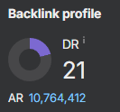 21 DR dofollow backlink from the main page