Header Business Modern

This carefully crafted Header component is perfect for Business landing pages, featuring a Modern design that looks great and converts well.
Simply copy the code with the "Copy" button, paste it into your project and customize the colors, text and images to match your brand.
                <!--
@type: Header
@industry: Business
@style: Modern
@category: Navigation, Page Section
@framework: HTML/CSS
@license: Free
-->

<style>
:root {
  --primary-color: #4f46e5; /* indigo-600 */
  --primary-color-hover: #4338ca; /* indigo-700 */
  --primary-color-light: #e0e7ff; /* indigo-200 */
  --text-main: #0f172a; /* slate-900 */
  --text-secondary: #475569; /* slate-600 */
  --bg-main: #f8fafc; /* slate-50 */
  --border-main: #e2e8f0; /* slate-200 */
  --radius-lg: 0.5rem;
  --shadow-lg: 0 10px 15px -3px rgba(31,41,55,0.1), 0 4px 6px -4px rgba(31,41,55,0.1);
  --font-main: ui-sans-serif, system-ui, sans-serif, "Apple Color Emoji", "Segoe UI Emoji", "Segoe UI Symbol", "Noto Color Emoji";
  --max-width: 80rem; /* 1280px */
  --transition: color 0.2s, background 0.2s, box-shadow 0.2s;
}
* {
  box-sizing: border-box;
  margin: 0;
  padding: 0;
  font-family: var(--font-main);
}
.header-modern {
  width: 100%;
  background: var(--bg-main);
  border-bottom: 1px solid var(--border-main);
  font-family: var(--font-main);
}
.header-modern__nav {
  max-width: var(--max-width);
  margin-left: auto;
  margin-right: auto;
  display: flex;
  align-items: center;
  justify-content: space-between;
  padding: 1rem 1.5rem;
}
.header-modern__brand {
  display: flex;
  align-items: center;
  gap: 1rem;
}
.header-modern__logo-link {
  display: flex;
  align-items: center;
  gap: 0.5rem;
  text-decoration: none;
}
.header-modern__logo {
  height: 2rem;
  width: auto;
  color: var(--primary-color);
  display: block;
}
.header-modern__brandname {
  font-size: 1.5rem;
  font-weight: 700;
  color: var(--text-main);
  letter-spacing: -0.02em;
}
.header-modern__links {
  display: none;
  align-items: center;
  gap: 2rem;
}
.header-modern__link {
  font-size: 1rem;
  color: var(--text-secondary);
  text-decoration: none;
  transition: var(--transition);
  outline: none;
  border-radius: var(--radius-lg);
  padding: 0;
}
.header-modern__link:focus {
  color: var(--primary-color-hover);
}
.header-modern__link:hover {
  color: var(--primary-color);
}
.header-modern__actions {
  display: none;
  align-items: center;
  gap: 1rem;
}
.header-modern__signin {
  font-size: 1rem;
  color: var(--text-secondary);
  text-decoration: none;
  padding: 0.5rem 1rem;
  border-radius: var(--radius-lg);
  transition: var(--transition);
  outline: none;
}
.header-modern__signin:hover {
  color: var(--primary-color);
}
.header-modern__signin:focus {
  color: var(--primary-color-hover);
}
.header-modern__signup {
  background: var(--primary-color);
  color: #fff;
  padding: 0.75rem 1.5rem;
  border-radius: var(--radius-lg);
  font-weight: 600;
  box-shadow: var(--shadow-lg);
  text-decoration: none;
  transition: var(--transition);
  outline: none;
  border: none;
  display: inline-block;
}
.header-modern__signup:hover {
  background: var(--primary-color-hover);
}
.header-modern__signup:focus {
  box-shadow: 0 0 0 2px var(--primary-color-light), 0 0 0 4px #fff;
}
.header-modern__menu-btn {
  display: inline-flex;
  align-items: center;
  justify-content: center;
  padding: 0.5rem;
  border-radius: var(--radius-lg);
  color: var(--text-secondary);
  background: none;
  border: none;
  cursor: pointer;
  transition: var(--transition);
  outline: none;
}
.header-modern__menu-btn:hover {
  color: var(--primary-color);
}
.header-modern__menu-btn:focus {
  box-shadow: 0 0 0 2px var(--primary-color-light);
}
.header-modern__menu-icon {
  height: 1.75rem;
  width: 1.75rem;
  display: block;
}
.header-modern__mobile-menu {
  display: none;
  background: var(--bg-main);
}
.header-modern__mobile-links {
  display: flex;
  flex-direction: column;
  gap: 0.5rem;
  padding: 0 1.5rem 1.5rem 1.5rem;
}
.header-modern__mobile-link {
  display: block;
  font-size: 1rem;
  color: var(--text-secondary);
  text-decoration: none;
  padding: 0.5rem 0;
  border-radius: var(--radius-lg);
  transition: var(--transition);
  outline: none;
}
.header-modern__mobile-link:hover {
  color: var(--primary-color);
}
.header-modern__mobile-link:focus {
  color: var(--primary-color-hover);
}
.header-modern__mobile-signup {
  display: block;
  background: var(--primary-color);
  color: #fff;
  padding: 0.75rem 1.5rem;
  border-radius: var(--radius-lg);
  font-weight: 600;
  box-shadow: var(--shadow-lg);
  text-decoration: none;
  transition: var(--transition);
  outline: none;
  border: none;
  margin-top: 0.5rem;
}
.header-modern__mobile-signup:hover {
  background: var(--primary-color-hover);
}
.header-modern__mobile-signup:focus {
  box-shadow: 0 0 0 2px var(--primary-color-light), 0 0 0 4px #fff;
}
@media (min-width: 768px) {
  .header-modern__links {
    display: flex;
  }
  .header-modern__actions {
    display: flex;
  }
  .header-modern__menu-btn {
    display: none;
  }
  .header-modern__mobile-menu {
    display: none !important;
  }
}
@media (max-width: 767.98px) {
  .header-modern__mobile-menu[aria-hidden="false"] {
    display: block;
  }
}
</style>
<section class="header-modern">
  <nav class="header-modern__nav" aria-label="Main navigation">
    <div class="header-modern__brand">
      <a href="#" class="header-modern__logo-link" aria-label="Home">
        <svg class="header-modern__logo" viewBox="0 0 24 24" fill="none" xmlns="http://www.w3.org/2000/svg">
          <path d="M12 2L2 7L12 12L22 7L12 2Z" stroke="currentColor" stroke-width="2" stroke-linecap="round" stroke-linejoin="round"/>
          <path d="M2 17L12 22L22 17" stroke="currentColor" stroke-width="2" stroke-linecap="round" stroke-linejoin="round"/>
          <path d="M2 12L12 17L22 12" stroke="currentColor" stroke-width="2" stroke-linecap="round" stroke-linejoin="round"/>
        </svg>
        <span class="header-modern__brandname">BusinessGo</span>
      </a>
    </div>
    <div class="header-modern__links">
      <a href="#features" class="header-modern__link" aria-current="page">Features</a>
      <a href="#pricing" class="header-modern__link">Pricing</a>
      <a href="#about" class="header-modern__link">About</a>
      <a href="#contact" class="header-modern__link">Contact</a>
    </div>
    <div class="header-modern__actions">
      <a href="#login" class="header-modern__signin">Sign in</a>
      <a href="#signup" class="header-modern__signup">Get Started</a>
    </div>
    <button type="button" class="header-modern__menu-btn" aria-controls="mobile-menu" aria-expanded="false" aria-label="Open main menu" id="mobile-menu-button">
      <svg class="header-modern__menu-icon" fill="none" stroke="currentColor" stroke-width="2" viewBox="0 0 24 24" aria-hidden="true">
        <path stroke-linecap="round" stroke-linejoin="round" d="M4 6h16M4 12h16M4 18h16" />
      </svg>
    </button>
  </nav>
  <div class="header-modern__mobile-menu" id="mobile-menu" aria-hidden="true">
    <div class="header-modern__mobile-links">
      <a href="#features" class="header-modern__mobile-link">Features</a>
      <a href="#pricing" class="header-modern__mobile-link">Pricing</a>
      <a href="#about" class="header-modern__mobile-link">About</a>
      <a href="#contact" class="header-modern__mobile-link">Contact</a>
      <a href="#login" class="header-modern__mobile-link">Sign in</a>
      <a href="#signup" class="header-modern__mobile-signup">Get Started</a>
    </div>
  </div>
  <script>
    // Mobile menu toggle
    const menuBtn = document.getElementById('mobile-menu-button');
    const mobileMenu = document.getElementById('mobile-menu');
    menuBtn.addEventListener('click', function() {
      const expanded = menuBtn.getAttribute('aria-expanded') === 'true';
      menuBtn.setAttribute('aria-expanded', !expanded);
      mobileMenu.setAttribute('aria-hidden', expanded);
    });
  </script>
</section>
                <!--
@type: Header
@industry: Business
@style: Modern
@category: Navigation, Page Section
@framework: Tailwind
@license: Free
-->
<section class="w-full bg-slate-50 font-inter font-sans border-b border-slate-200">
  <nav class="max-w-7xl mx-auto flex items-center justify-between px-6 py-4" aria-label="Main navigation">
    <div class="flex items-center gap-4">
      <a href="#" class="flex items-center gap-2" aria-label="Home">
        <svg class="h-8 w-auto text-indigo-600" viewBox="0 0 24 24" fill="none" xmlns="http://www.w3.org/2000/svg">
          <path d="M12 2L2 7L12 12L22 7L12 2Z" stroke="currentColor" stroke-width="2" stroke-linecap="round" stroke-linejoin="round"/>
          <path d="M2 17L12 22L22 17" stroke="currentColor" stroke-width="2" stroke-linecap="round" stroke-linejoin="round"/>
          <path d="M2 12L12 17L22 12" stroke="currentColor" stroke-width="2" stroke-linecap="round" stroke-linejoin="round"/>
        </svg>
        <span class="text-2xl font-bold text-slate-900 tracking-tight">BusinessGo</span>
      </a>
    </div>
    <div class="hidden md:flex items-center gap-8">
      <a href="#features" class="text-base text-slate-600 hover:text-indigo-600 transition-colors focus:outline-none focus:text-indigo-700" aria-current="page">Features</a>
      <a href="#pricing" class="text-base text-slate-600 hover:text-indigo-600 transition-colors focus:outline-none focus:text-indigo-700">Pricing</a>
      <a href="#about" class="text-base text-slate-600 hover:text-indigo-600 transition-colors focus:outline-none focus:text-indigo-700">About</a>
      <a href="#contact" class="text-base text-slate-600 hover:text-indigo-600 transition-colors focus:outline-none focus:text-indigo-700">Contact</a>
    </div>
    <div class="hidden md:flex items-center gap-4">
      <a href="#login" class="text-base text-slate-600 hover:text-indigo-600 transition-colors px-4 py-2 rounded-lg focus:outline-none focus:text-indigo-700">Sign in</a>
      <a href="#signup" class="bg-indigo-600 text-white px-6 py-3 rounded-lg font-semibold shadow-lg hover:bg-indigo-700 transition-colors focus:outline-none focus:ring-2 focus:ring-indigo-200 focus:ring-offset-2">Get Started</a>
    </div>
    <!-- Mobile menu button -->
    <button type="button" class="md:hidden inline-flex items-center justify-center p-2 rounded-lg text-slate-600 hover:text-indigo-600 focus:outline-none focus:ring-2 focus:ring-indigo-200" aria-controls="mobile-menu" aria-expanded="false" aria-label="Open main menu" id="mobile-menu-button">
      <svg class="h-7 w-7" fill="none" stroke="currentColor" stroke-width="2" viewBox="0 0 24 24" aria-hidden="true">
        <path stroke-linecap="round" stroke-linejoin="round" d="M4 6h16M4 12h16M4 18h16" />
      </svg>
    </button>
  </nav>
  <!-- Mobile menu -->
  <div class="md:hidden" id="mobile-menu" hidden>
    <div class="px-6 pb-6 flex flex-col gap-2">
      <a href="#features" class="block text-base text-slate-600 hover:text-indigo-600 transition-colors py-2 rounded-lg focus:outline-none focus:text-indigo-700">Features</a>
      <a href="#pricing" class="block text-base text-slate-600 hover:text-indigo-600 transition-colors py-2 rounded-lg focus:outline-none focus:text-indigo-700">Pricing</a>
      <a href="#about" class="block text-base text-slate-600 hover:text-indigo-600 transition-colors py-2 rounded-lg focus:outline-none focus:text-indigo-700">About</a>
      <a href="#contact" class="block text-base text-slate-600 hover:text-indigo-600 transition-colors py-2 rounded-lg focus:outline-none focus:text-indigo-700">Contact</a>
      <a href="#login" class="block text-base text-slate-600 hover:text-indigo-600 transition-colors py-2 rounded-lg focus:outline-none focus:text-indigo-700">Sign in</a>
      <a href="#signup" class="block bg-indigo-600 text-white px-6 py-3 rounded-lg font-semibold shadow-lg hover:bg-indigo-700 transition-colors focus:outline-none focus:ring-2 focus:ring-indigo-200 focus:ring-offset-2 mt-2">Get Started</a>
    </div>
  </div>
  <script>
    // Mobile menu toggle
    const menuBtn = document.getElementById('mobile-menu-button');
    const mobileMenu = document.getElementById('mobile-menu');
    menuBtn.addEventListener('click', function() {
      const expanded = menuBtn.getAttribute('aria-expanded') === 'true';
      menuBtn.setAttribute('aria-expanded', !expanded);
      mobileMenu.hidden = expanded;
    });
  </script>
</section>
This is a Pro component
Access the full component collection
Get all premium components and focus on building your business
Unlock for $49
(one-time payment)Early bird discount. Lock in this price forever
Premium components
Get access to all pro components. New ones added monthly
Save components
Save your favorite components to your account
Unlimited usage
Use components as often as you want
Landing page submissions
Get your landing pages featured on LandingGo and earn a
strong backlink
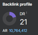 21 DR dofollow backlink from the main page