Hero SaaS Minimal
This carefully crafted Hero component is perfect for SaaS landing pages, featuring a Minimal design that looks great and converts well.
Simply copy the code with the "Copy" button, paste it into your project and customize the colors, text and images to match your brand.
<!--
@type: Hero
@industry: SaaS
@style: Minimal
@category: Page Section, Content, Sale
@framework: HTML/CSS
@license: Free
-->
<style>
/* CSS Custom Properties */
:root {
/* Colors */
--color-white: #ffffff;
--color-gray-50: #f9fafb;
--color-gray-200: #e5e7eb;
--color-gray-300: #d1d5db;
--color-gray-400: #9ca3af;
--color-gray-600: #4b5563;
--color-gray-900: #111827;
--color-blue-50: #eff6ff;
--color-blue-100: #dbeafe;
--color-blue-600: #2563eb;
--color-blue-700: #1d4ed8;
/* Spacing */
--spacing-1: 0.25rem;
--spacing-2: 0.5rem;
--spacing-3: 0.75rem;
--spacing-4: 1rem;
--spacing-6: 1.5rem;
--spacing-8: 2rem;
--spacing-12: 3rem;
--spacing-16: 4rem;
--spacing-20: 5rem;
/* Font Sizes */
--text-sm: 0.875rem;
--text-base: 1rem;
--text-xl: 1.25rem;
--text-2xl: 1.5rem;
--text-4xl: 2.25rem;
--text-5xl: 3rem;
--text-6xl: 3.75rem;
}
/* Reset */
* {
box-sizing: border-box;
margin: 0;
padding: 0;
font-family: ui-sans-serif, system-ui, sans-serif, "Apple Color Emoji", "Segoe UI Emoji", "Segoe UI Symbol", "Noto Color Emoji";
}
/* Component Styles */
.hero-section {
position: relative;
background-color: var(--color-white);
overflow: hidden;
}
.hero-background {
position: absolute;
inset: 0;
background: linear-gradient(to bottom, var(--color-gray-50), var(--color-white));
}
.hero-container {
position: relative;
max-width: 80rem;
margin: 0 auto;
padding: var(--spacing-12) var(--spacing-4);
}
.hero-grid {
display: grid;
grid-template-columns: 1fr;
gap: var(--spacing-12);
align-items: center;
}
.hero-content {
text-align: left;
}
.hero-badge {
display: inline-flex;
align-items: center;
padding: var(--spacing-1) var(--spacing-3);
border-radius: 9999px;
font-size: var(--text-sm);
font-weight: 500;
background-color: var(--color-blue-50);
color: var(--color-blue-600);
margin-bottom: var(--spacing-6);
}
.hero-title {
font-size: var(--text-4xl);
font-weight: 700;
color: var(--color-gray-900);
line-height: 1;
margin-bottom: var(--spacing-6);
}
.hero-description {
font-size: var(--text-xl);
color: var(--color-gray-600);
margin-bottom: var(--spacing-8);
max-width: 42rem;
}
.hero-buttons {
display: flex;
flex-direction: column;
gap: var(--spacing-4);
}
.button-primary {
display: inline-flex;
align-items: center;
justify-content: center;
padding: var(--spacing-3) var(--spacing-6);
border: 1px solid transparent;
border-radius: 0.5rem;
font-size: var(--text-base);
font-weight: 500;
color: var(--color-white);
background-color: var(--color-blue-600);
transition: background-color 150ms ease-in-out;
text-decoration: none;
}
.button-primary:hover {
background-color: var(--color-blue-700);
}
.button-secondary {
display: inline-flex;
align-items: center;
justify-content: center;
padding: var(--spacing-3) var(--spacing-6);
border: 1px solid var(--color-gray-300);
border-radius: 0.5rem;
font-size: var(--text-base);
font-weight: 500;
color: var(--color-gray-900);
background-color: var(--color-white);
transition: background-color 150ms ease-in-out;
text-decoration: none;
}
.button-secondary:hover {
background-color: var(--color-gray-50);
}
.button-icon {
width: 1.25rem;
height: 1.25rem;
margin-right: var(--spacing-2);
}
.hero-brands {
margin-top: var(--spacing-8);
padding-top: var(--spacing-8);
border-top: 1px solid var(--color-gray-200);
}
.hero-brands-title {
font-size: var(--text-sm);
color: var(--color-gray-600);
margin-bottom: var(--spacing-4);
}
.hero-brands-grid {
display: flex;
flex-wrap: wrap;
align-items: center;
gap: var(--spacing-4) var(--spacing-8);
}
.brand-name {
color: var(--color-gray-400);
font-weight: 500;
}
.hero-image-container {
position: relative;
}
.hero-image {
border-radius: 0.75rem;
box-shadow: 0 25px 50px -12px rgba(0, 0, 0, 0.25);
width: 100%;
max-width: 32rem;
margin: 0 auto;
height: auto;
aspect-ratio: 1320 / 900;
object-fit: cover;
}
.stats-card {
position: absolute;
bottom: -1.5rem;
left: -1.5rem;
background-color: var(--color-white);
border-radius: 0.5rem;
box-shadow: 0 10px 15px -3px rgba(0, 0, 0, 0.1);
padding: var(--spacing-6);
display: none;
}
.stats-icon-container {
width: 3rem;
height: 3rem;
background-color: var(--color-blue-100);
border-radius: 9999px;
display: flex;
align-items: center;
justify-content: center;
flex-shrink: 0;
}
.stats-icon {
width: 1.5rem;
height: 1.5rem;
color: var(--color-blue-600);
}
.stats-content {
display: flex;
align-items: center;
gap: var(--spacing-4);
}
.stats-number {
font-size: var(--text-2xl);
font-weight: 700;
color: var(--color-gray-900);
}
.stats-label {
font-size: var(--text-sm);
color: var(--color-gray-600);
}
/* Responsive Breakpoints */
@media (min-width: 640px) {
.hero-container {
padding-left: var(--spacing-6);
padding-right: var(--spacing-6);
}
.hero-title {
font-size: var(--text-5xl);
}
.hero-buttons {
flex-direction: row;
}
}
@media (min-width: 768px) {
.hero-container {
padding-top: var(--spacing-16);
padding-bottom: var(--spacing-16);
}
.stats-card {
display: block;
}
}
@media (min-width: 1024px) {
.hero-container {
padding-left: var(--spacing-8);
padding-right: var(--spacing-8);
padding-top: var(--spacing-20);
padding-bottom: var(--spacing-20);
}
.hero-grid {
grid-template-columns: 1fr 1fr;
}
.hero-title {
font-size: var(--text-6xl);
}
.hero-image {
max-width: none;
}
}
</style>
<!-- Minimal SaaS Hero Section -->
<section class="hero-section">
<!-- Background pattern -->
<div class="hero-background"></div>
<!-- Main container -->
<div class="hero-container">
<div class="hero-grid">
<!-- Left column - Content -->
<div class="hero-content">
<span class="hero-badge">
New Release
</span>
<h1 class="hero-title">
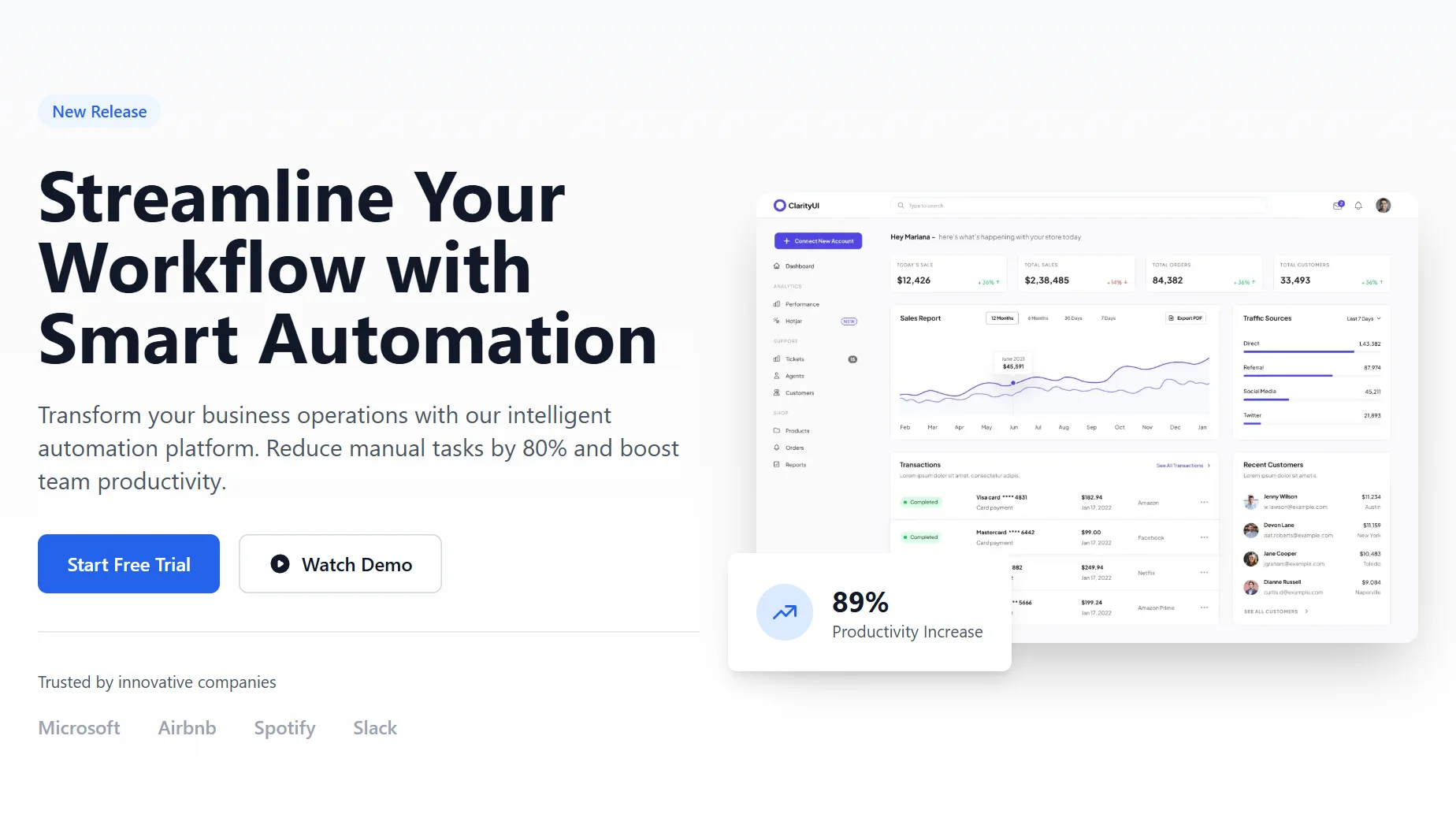
Streamline Your Workflow with Smart Automation
</h1>
<p class="hero-description">
Transform your business operations with our intelligent automation platform. Reduce manual tasks by 80% and boost team productivity.
</p>
<div class="hero-buttons">
<a href="#" class="button-primary" role="button" aria-label="Start free trial">
Start Free Trial
</a>
<a href="#" class="button-secondary" role="button" aria-label="Watch demo video">
<svg class="button-icon" fill="currentColor" viewBox="0 0 20 20">
<path fill-rule="evenodd" d="M10 18a8 8 0 100-16 8 8 0 000 16zM9.555 7.168A1 1 0 008 8v4a1 1 0 001.555.832l3-2a1 1 0 000-1.664l-3-2z" clip-rule="evenodd"/>
</svg>
Watch Demo
</a>
</div>
<div class="hero-brands">
<p class="hero-brands-title">Trusted by innovative companies</p>
<div class="hero-brands-grid">
<span class="brand-name">Microsoft</span>
<span class="brand-name">Airbnb</span>
<span class="brand-name">Spotify</span>
<span class="brand-name">Slack</span>
</div>
</div>
</div>
<!-- Right column - Image -->
<div class="hero-image-container">
<img
src="https://landinggo.com/assets/img/stock/hero/saas-figcomp-1320x900.webp"
alt="Dashboard interface showing automation workflow"
class="hero-image"
width="1320"
height="900"
loading="lazy"
/>
<!-- Stats card -->
<div class="stats-card">
<div class="stats-content">
<div class="stats-icon-container">
<svg class="stats-icon" fill="none" stroke="currentColor" viewBox="0 0 24 24">
<path stroke-linecap="round" stroke-linejoin="round" stroke-width="2" d="M13 7h8m0 0v8m0-8l-8 8-4-4-6 6"/>
</svg>
</div>
<div>
<p class="stats-number">89%</p>
<p class="stats-label">Productivity Increase</p>
</div>
</div>
</div>
</div>
</div>
</div>
</section>
                <!--
@type: Hero
@industry: SaaS
@style: Minimal
@category: Page Section, Content, Sale
@framework: Tailwind
@license: Free
-->

<!-- Minimal SaaS Hero Section -->
<section class="relative bg-white overflow-hidden">
    <!-- Background pattern -->
    <div class="absolute inset-0 bg-gradient-to-b from-gray-50 to-white"></div>

    <!-- Main container -->
    <div class="relative max-w-7xl mx-auto px-4 sm:px-6 lg:px-8 py-12 md:py-16 lg:py-20">
        <div class="grid grid-cols-1 lg:grid-cols-2 gap-12 items-center">
            <!-- Left column - Content -->
            <div class="text-left">
                <span class="inline-flex items-center px-3 py-1 rounded-full text-sm font-medium bg-blue-50 text-blue-600 mb-6">
                    New Release
                </span>
                <h1 class="text-4xl sm:text-5xl lg:text-6xl font-bold text-gray-900 leading-tight mb-6">
                    Streamline Your Workflow with Smart Automation
                </h1>
                <p class="text-xl text-gray-600 mb-8 max-w-2xl">
                    Transform your business operations with our intelligent automation platform. Reduce manual tasks by 80% and boost team productivity.
                </p>
                <div class="flex flex-col sm:flex-row gap-4">
                    <a href="#" class="inline-flex items-center justify-center px-6 py-3 border border-transparent rounded-lg text-base font-medium text-white bg-blue-600 hover:bg-blue-700 transition duration-150 ease-in-out" role="button" aria-label="Start free trial">
                        Start Free Trial
                    </a>
                    <a href="#" class="inline-flex items-center justify-center px-6 py-3 border border-gray-300 rounded-lg text-base font-medium text-gray-900 bg-white hover:bg-gray-50 transition duration-150 ease-in-out" role="button" aria-label="Watch demo video">
                        <svg class="w-5 h-5 mr-2" fill="currentColor" viewBox="0 0 20 20">
                            <path fill-rule="evenodd" d="M10 18a8 8 0 100-16 8 8 0 000 16zM9.555 7.168A1 1 0 008 8v4a1 1 0 001.555.832l3-2a1 1 0 000-1.664l-3-2z" clip-rule="evenodd"/>
                        </svg>
                        Watch Demo
                    </a>
                </div>
                <div class="mt-8 pt-8 border-t border-gray-200">
                    <p class="text-sm text-gray-600 mb-4">Trusted by innovative companies</p>
                    <div class="flex flex-wrap items-center gap-x-8 gap-y-4">
                        <span class="text-gray-400 font-medium">Microsoft</span>
                        <span class="text-gray-400 font-medium">Airbnb</span>
                        <span class="text-gray-400 font-medium">Spotify</span>
                        <span class="text-gray-400 font-medium">Slack</span>
                    </div>
                </div>
            </div>

            <!-- Right column - Image -->
            <div class="relative">
                <!-- SaaS image by Figcomponents (CC BY 4.0) -->
                <img
                    src="https://landinggo.com/assets/img/stock/hero/saas-figcomp-1320x900.webp"
                    alt="Dashboard interface showing automation workflow"
                    class="rounded-xl shadow-2xl w-full max-w-lg lg:max-w-none mx-auto"
                    width="1320"
                    height="900"
                    loading="lazy"
                />
                <!-- Stats card -->
                <div class="absolute -bottom-6 -left-6 bg-white rounded-lg shadow-lg p-6 hidden md:block">
                    <div class="flex items-center space-x-4">
                        <div class="flex-shrink-0">
                            <div class="w-12 h-12 bg-blue-100 rounded-full flex items-center justify-center">
                                <svg class="w-6 h-6 text-blue-600" fill="none" stroke="currentColor" viewBox="0 0 24 24">
                                    <path stroke-linecap="round" stroke-linejoin="round" stroke-width="2" d="M13 7h8m0 0v8m0-8l-8 8-4-4-6 6"/>
                                </svg>
                            </div>
                        </div>
                        <div>
                            <p class="text-2xl font-bold text-gray-900">89%</p>
                            <p class="text-sm text-gray-600">Productivity Increase</p>
                        </div>
                    </div>
                </div>
            </div>
        </div>
    </div>
</section>
This is a Pro component
Access the full component collection
Get all premium components and focus on building your business
Unlock for $49
(one-time payment)Early bird discount. Lock in this price forever
Premium components
Get access to all pro components. New ones added monthly
Save components
Save your favorite components to your account
Unlimited usage
Use components as often as you want
Landing page submissions
Get your landing pages featured on LandingGo and earn a
strong backlink
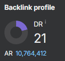 21 DR dofollow backlink from the main page