
Header Book Minimal

This carefully crafted Header component is perfect for Book landing pages, featuring a Minimal design that looks great and converts well.
Simply copy the code with the "Copy" button, paste it into your project and customize the colors, text and images to match your brand.
                <!--
@type: Header
@industry: Book
@style: Minimal
@category: Navigation, Page Section, UI Elements
@framework: Tailwind
@license: Free
-->

<header class="bg-amber-50 border-b border-amber-200">
  <div class="max-w-7xl mx-auto px-6">
    <div class="grid md:grid-cols-2 items-center">

      <!-- Left Side - Logo & Navigation -->
      <div class="py-6">
        <div class="flex items-center justify-between md:justify-start gap-12">
          <!-- Logo -->
          <a href="#" class="flex items-center gap-3 group">
            <div class="w-10 h-10 bg-amber-900 flex items-center justify-center">
              <svg class="w-6 h-6 text-amber-50" fill="none" stroke="currentColor" viewBox="0 0 24 24">
                <path stroke-linecap="round" stroke-linejoin="round" stroke-width="1.5"
                  d="M12 6.253v13m0-13C10.832 5.477 9.246 5 7.5 5S4.168 5.477 3 6.253v13C4.168 18.477 5.754 18 7.5 18s3.332.477 4.5 1.253m0-13C13.168 5.477 14.754 5 16.5 5c1.747 0 3.332.477 4.5 1.253v13C19.832 18.477 18.247 18 16.5 18c-1.746 0-3.332.477-4.5 1.253" />
              </svg>
            </div>
            <div>
              <h1 class="text-xl font-light text-amber-950 tracking-wide">SOLITUDE</h1>
              <p class="text-xs text-amber-700 tracking-widest">PRESS</p>
            </div>
          </a>

          <!-- Mobile Menu Button -->
          <button onclick="toggleMobileMenu()" class="md:hidden text-amber-900">
            <svg id="menuIcon" class="w-6 h-6" fill="none" stroke="currentColor" viewBox="0 0 24 24">
              <path stroke-linecap="round" stroke-linejoin="round" stroke-width="2" d="M4 6h16M4 12h16M4 18h16" />
            </svg>
            <svg id="closeIcon" class="w-6 h-6 hidden" fill="none" stroke="currentColor" viewBox="0 0 24 24">
              <path stroke-linecap="round" stroke-linejoin="round" stroke-width="2" d="M6 18L18 6M6 6l12 12" />
            </svg>
          </button>

          <!-- Desktop Navigation -->
          <nav class="hidden md:flex items-center gap-8">
            <a href="#" class="text-amber-950 hover:text-amber-700 text-sm tracking-wide transition-colors">Books</a>
            <a href="#" class="text-amber-700 hover:text-amber-950 text-sm tracking-wide transition-colors">Authors</a>
            <a href="#" class="text-amber-700 hover:text-amber-950 text-sm tracking-wide transition-colors">Collections</a>
            <a href="#" class="text-amber-700 hover:text-amber-950 text-sm tracking-wide transition-colors">About</a>
          </nav>
        </div>
      </div>

      <!-- Right Side - Actions -->
      <div class="hidden md:flex items-center justify-end gap-6 py-6">
        <!-- Search -->
        <button class="text-amber-800 hover:text-amber-950 transition-colors">
          <svg class="w-5 h-5" fill="none" stroke="currentColor" viewBox="0 0 24 24">
            <path stroke-linecap="round" stroke-linejoin="round" stroke-width="1.5"
              d="M21 21l-6-6m2-5a7 7 0 11-14 0 7 7 0 0114 0z" />
          </svg>
        </button>

        <!-- Cart -->
        <button class="text-amber-800 hover:text-amber-950 transition-colors relative">
          <svg class="w-5 h-5" fill="none" stroke="currentColor" viewBox="0 0 24 24">
            <path stroke-linecap="round" stroke-linejoin="round" stroke-width="1.5"
              d="M16 11V7a4 4 0 00-8 0v4M5 9h14l1 12H4L5 9z" />
          </svg>
        </button>

        <!-- Divider -->
        <div class="w-px h-6 bg-amber-300"></div>

        <!-- Account -->
        <a href="#" class="text-amber-700 hover:text-amber-950 text-sm tracking-wide transition-colors">Sign In</a>

        <!-- CTA Button -->
        <button
          class="bg-amber-900 text-amber-50 px-5 py-2 text-sm tracking-wide hover:bg-amber-800 transition-colors">
          Subscribe
        </button>
      </div>

    </div>
  </div>

  <!-- Mobile Menu -->
  <div id="mobileMenu" class="hidden border-t border-amber-200 bg-amber-50">
    <nav class="container mx-auto px-6 py-6 space-y-4">
      <a href="#" class="block text-amber-950 hover:text-amber-700 text-sm tracking-wide transition-colors py-2">Books</a>
      <a href="#"
        class="block text-amber-700 hover:text-amber-950 text-sm tracking-wide transition-colors py-2">Authors</a>
      <a href="#"
        class="block text-amber-700 hover:text-amber-950 text-sm tracking-wide transition-colors py-2">Collections</a>
      <a href="#" class="block text-amber-700 hover:text-amber-950 text-sm tracking-wide transition-colors py-2">About</a>

      <div class="pt-4 border-t border-amber-200 space-y-4">
        <a href="#" class="block text-amber-700 hover:text-amber-950 text-sm tracking-wide transition-colors py-2">Sign
          In</a>
        <button
          class="w-full bg-amber-900 text-amber-50 px-5 py-3 text-sm tracking-wide hover:bg-amber-800 transition-colors">
          Subscribe
        </button>
      </div>
    </nav>
  </div>
</header>

<script>
  let mobileMenuOpen = false;

  function toggleMobileMenu() {
    mobileMenuOpen = !mobileMenuOpen;
    const menu = document.getElementById('mobileMenu');
    const menuIcon = document.getElementById('menuIcon');
    const closeIcon = document.getElementById('closeIcon');

    if (mobileMenuOpen) {
      menu.classList.remove('hidden');
      menuIcon.classList.add('hidden');
      closeIcon.classList.remove('hidden');
    } else {
      menu.classList.add('hidden');
      menuIcon.classList.remove('hidden');
      closeIcon.classList.add('hidden');
    }
  }
</script>
This is a Pro component
Access the full component collection
Get all premium components and focus on building your business
Unlock for $49
(one-time payment)Early bird discount. Lock in this price forever
Premium components
Get access to all pro components. New ones added monthly
Save components
Save your favorite components to your account
Unlimited usage
Use components as often as you want
Landing page submissions
Get your landing pages featured on LandingGo and earn a
strong backlink
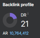 21 DR dofollow backlink from the main page